

Ux Stories
Design solutions crafted with purpose, clarity, and attention to detail.
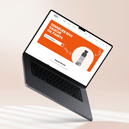
This is how I improved Skriblbox conversions PROBLEM
PROBLEM
Skriblbox is an e-commerce store based in Palm Jumeirah, UAE. The brand was running paid ads and generating traffic successfully, but users were not converting. The website had variable products, poor categorization, cluttered landing pages, and a confusing product selection flow. Customers often browsed but left without placing a single order.
HOW I WORKED
I conducted a full UX audit and immediately identified major structural issues:
🔸 Products were not categorized properly.
🔸 Variable product selection was confusing.
🔸 Landing pages were overcrowded and lacked hierarchy.
I redesigned the landing experience into three focused core sections:
WEBSITE HIERARCHY:
🔹 Hero Section – Strong headline with a real in-store video to build authenticity and trust.
🔹 Top Brands Section – Clear brand listing to improve navigation and recognition.
🔹 Product Display Section – Simplified product cards with clear “Select & Order” functionality.
I also refined product imagery using brand-aligned editing to create a premium and cohesive visual experience.
This new flow allowed users to:
✅ See the authentic store environment.
✅ Quickly discover top brands.
✅ Select and order products without friction.
RESULTS
✅Conversion rate increased by 15%.
✅Product discovery improved significantly.
✅Bounce rate from landing pages reduced due to clearer structure and simplified ordering flow.
✅Product discovery improved significantly.
✅Bounce rate from landing pages reduced due to clearer structure and simplified ordering flow.
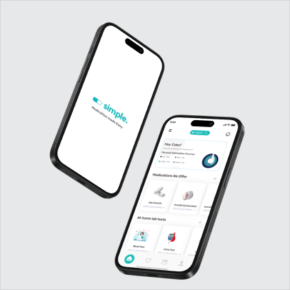
This is how I optimized Simple’s consultation flow
PROBLEM
Simple is a healthcare platform where users seek medical consultation and order prescribed medicine. Many users were visiting the website but struggling to find the consultation form. Even when they found it, the 60-question-long form caused drop-offs due to poor categorization and overwhelming structure.
HOW I WORKED
I began by analyzing the entire workflow and identified that the main issue was form friction and visibility.
Key improvements:
🔸 Placed the consultation form clearly in the second section of the homepage.
🔸 Added a strong CTA: “Get Free Consultation”.
🔸 Divided the 60 questions into 5 clear categories with headings.
🔸 Implemented pagination (12 questions per step).
🔸 Enabled auto-save after each step.
🔸 Allowed users to pause and resume the form later without losing data.
This approach reduced cognitive load and gave users control over their progress.
RESULTS
🚀 Form completion rate increased significantly.
📉 Drop-offs reduced due to structured progression.
✅ Improved conversion into recurring monthly patients due to saved-progress feature.
📉 Drop-offs reduced due to structured progression.
✅ Improved conversion into recurring monthly patients due to saved-progress feature.
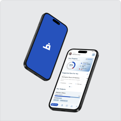
This is how I improved retention for CSS Fanoos
PROBLEM
CSS Fanoos is an e-learning app for competitive exam students with 1,000+ downloads on App Store and Play Store. Despite strong installs, the founder noticed high churn and poor retention due to outdated UI/UX and lack of engagement mechanisms.
HOW I WORKED
I redesigned the experience with a focus on motivation and engagement:
🔸 Introduced daily streak feature to encourage consistency.
🔸 Redesigned UI with modern card layouts.
🔸 Improved visual hierarchy and readability.
🔸 Added smooth micro-animations for better interaction feedback.
🔸 Enhanced dashboard clarity for competitive learners.
The streak system was especially impactful for competitive students, as it introduced behavioral motivation and habit-building.
RESULTS
🔸 Retention rate improved significantly.
🔸 Daily active usage increased.
🔸 App engagement strengthened through streak-based motivation.
🔸 Overall user satisfaction improved with modernized UI.
🔸 Daily active usage increased.
🔸 App engagement strengthened through streak-based motivation.
🔸 Overall user satisfaction improved with modernized UI.